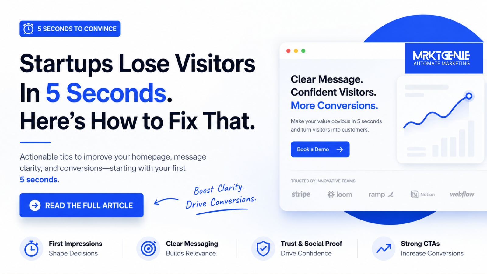
For startups, this is a costly problem. Paid traffic becomes wasted spend, organic traffic fails to convert, and hard-won referrals bounce before they ever book a demo or start a trial. Homepage clarity and conversion optimization are not cosmetic concerns. They are growth fundamentals.
This article breaks down why startup websites fail so quickly, how first impressions shape conversion behavior, and what to fix in your hero section, messaging, social proof, and calls to action.
1. First Impression Psychology
Website visitors do not read first. They scan. In a few seconds, they ask a silent set of questions:
- What is this?
- Is it for me?
- Can I trust it?
- What should I do next?
If your homepage does not answer those questions immediately, users experience friction. Friction creates uncertainty, and uncertainty kills conversion.
Psychologically, first impressions are driven by cognitive ease. When a page is easy to understand, users feel more confident in the brand behind it. When a page is hard to decode, they assume the product may be equally difficult. This is especially true for startups, where brand recognition is still low and trust has not yet been earned.
Visitors also rely on visual hierarchy to process information. They notice headlines, subheads, buttons, logos, and imagery before they read body copy. If the hierarchy is weak, they cannot quickly identify the value proposition. A startup may think it is being clever or modern, but users often interpret ambiguity as irrelevance.
Your homepage is not a brochure. It is a decision environment.
Strong startup websites reduce mental effort. They make the offer obvious, the audience clear, and the next step simple. Weak websites force visitors to work too hard, and most will not.
2. Hero Section Mistakes
The hero section is the most important real estate on a startup homepage. It is where first impressions are formed and where attention is either captured or lost. Yet this is exactly where many startups make their biggest mistakes.
Using vague headlines
Headlines like “Reinventing the Future of Work” or “The Operating System for Modern Teams” may sound ambitious, but they often say nothing concrete. A strong headline should explain what the product does and who it helps.
Compare these two examples:
- Weak: “Smarter growth for modern businesses”
- Strong: “Customer onboarding software for B2B SaaS teams”
The second version is specific, understandable, and immediately useful.
Leading with design instead of clarity
Many startup websites prioritize motion graphics, abstract illustrations, or oversized product renders over communication. Visual polish matters, but not at the expense of comprehension. If your visuals distract from the message, they are hurting performance.
Too many calls to action
A hero section with “Book Demo,” “Start Free Trial,” “Watch Video,” “Learn More,” and “Contact Sales” all competing for attention creates decision paralysis. The best startup homepages choose one primary action and one secondary action at most.
Feature overload
Trying to explain every capability above the fold usually backfires. Visitors do not need the full product tour in the hero section. They need a reason to keep scrolling or click.
Missing audience context
If a homepage does not identify the target customer, users may assume the product is not for them. This is common in startups serving multiple segments. Broad messaging feels inclusive internally, but externally it often feels generic.
An effective hero section usually includes:
- A clear headline that states the core value proposition
- A supporting subheadline that explains how it works or who it serves
- A primary CTA tied to buyer intent
- A visual that supports understanding, such as product UI or a relevant use case
- Optional trust cues, such as customer logos or a short proof statement
3. Messaging Clarity
Messaging clarity is one of the biggest conversion levers on any startup website. If people cannot understand your offer quickly, they will not convert, no matter how strong your product is.
Clear messaging starts with simple language. Many startups write for investors, peers, or internal teams instead of customers. This leads to jargon-heavy copy full of phrases like “end-to-end visibility,” “AI-powered transformation,” or “next-generation infrastructure.” These terms may sound impressive, but they rarely help visitors understand outcomes.
Good homepage messaging answers three things:
- What the product is
- Who it is for
- Why it matters
For example, instead of saying, “We unlock intelligent workflow orchestration across distributed environments,” say, “Automate invoice approvals across finance teams in one dashboard.” The second version is specific, visual, and outcome-driven.
How to improve homepage clarity
- Use concrete nouns over abstract language
- Describe problems customers already recognize
- Focus on outcomes, not internal terminology
- Write at a scanning level, not a reading level
- Test whether a first-time visitor can explain your product after five seconds
Clarity does not mean being simplistic. It means being understandable. The most effective startup websites are not necessarily the most creative. They are the easiest to grasp.
Another common issue is message mismatch. A visitor clicks an ad, search result, or LinkedIn post expecting one thing, then lands on a homepage that talks about something else. This disconnect increases bounce rates and lowers trust. Your homepage should align with the promise that brought the visitor there.
If your startup needs a sales call to explain what it does, your homepage is underperforming.
4. Social Proof Placement
Social proof is one of the fastest ways to reduce skepticism, but many startup websites place it too low on the page or present it too weakly to matter. Trust should appear early, not as an afterthought.
When a visitor lands on a startup homepage, they are evaluating risk. Since your brand may be unfamiliar, they look for signals that others already trust you. This can include customer logos, testimonials, usage numbers, media mentions, ratings, or case study references.
Where social proof works best
- Near the hero section to reinforce credibility early
- Below the value proposition to support your claims
- Next to CTAs to reduce hesitation
- Before pricing or demo requests to increase confidence
The key is relevance. Generic testimonials like “Amazing platform” are less persuasive than proof tied to outcomes. A better testimonial might say, “We reduced onboarding time by 43% in two months.” Specificity makes proof believable.
Common social proof mistakes
- Using logos without recognizable brands or context
- Hiding testimonials deep on the page
- Featuring praise that says nothing measurable
- Overloading the page with too many badges and trust icons
- Using social proof that does not match the target audience
If your startup is early-stage and lacks enterprise logos, use other forms of trust. You can highlight founder credibility, investor backing, product usage data, customer results, pilot program outcomes, or industry-specific endorsements. Trust does not have to come from big brands alone.
What matters most is placement and specificity. Social proof should support the exact moment when a user is deciding whether to continue.
5. CTA Optimization
Even when startup websites get the messaging right, many still fail because the call to action is weak, confusing, or poorly timed. A CTA is not just a button. It is the bridge between interest and action.
Why CTAs underperform
Common CTA problems include vague wording, too many competing options, weak visual contrast, and asking for too much commitment too soon. A first-time visitor may not be ready to “Talk to Sales,” especially if the homepage has not yet built enough trust.
What makes a high-converting CTA
- Clear action language
- Alignment with user intent
- Strong visual prominence
- Low friction where possible
- Context around what happens next
For example, “Get Started” is often too generic. “Start Free Trial,” “See the Platform,” or “Book a 15-Minute Demo” sets better expectations. Specific CTAs reduce uncertainty and improve click-through rates.
Intent also matters. A product-led SaaS company may benefit from a self-serve CTA like “Start Free.” A high-ticket B2B startup may need “Book Demo” as the primary path. The CTA should reflect the buying motion, not just internal preferences.
Best practices for startup CTA optimization
- Use one primary CTA in the hero section
- Repeat the CTA throughout the page at logical decision points
- Add supporting microcopy when commitment is high
- Test button copy based on buyer stage
- Remove unnecessary form fields if using lead capture
Microcopy can be especially effective. A line like “No credit card required” or “See how it works in 2 minutes” lowers friction and reassures users.
It is also important to match CTA placement with page flow. If a user has just seen a customer result, that is a strong moment to place a conversion button. If they are still trying to understand the product, a hard sales CTA may feel premature.
6. Website Teardown Examples
To see how these issues play out, here are a few simplified teardown examples based on common startup homepage patterns.
Example 1: The vague AI startup
A startup homepage opens with the headline “The intelligence layer for modern operations.” The subheadline mentions automation, insights, and scale, but never explains what the product actually does. The hero image is an abstract animation. The CTA says “Learn More.”
Why it fails in 5 seconds:
- No clear product category
- No obvious target audience
- No visible proof
- No compelling next step
How to fix it:
- Replace the headline with a concrete offer, such as “AI workflow automation for supply chain teams”
- Show a real product screenshot
- Add customer logos or a measurable result
- Change the CTA to “Book Demo” or “See Workflow Examples”
Example 2: The feature-stuffed SaaS homepage
This site lists eight features in the hero section, followed by three product tabs, two videos, and four CTAs. The copy is detailed but overwhelming. There is no clear hierarchy.
Why it fails in 5 seconds:
- Too much information too early
- No primary message
- Competing actions create friction
- Scanning users cannot find the main point
How to fix it:
- Lead with one core value proposition
- Reduce hero content to headline, subheadline, and one primary CTA
- Move secondary features lower on the page
- Use section headings to guide the narrative
Example 3: The credibility gap
A startup has a clean design and a clear product description, but there is no evidence anyone uses it. No customer logos, no testimonials, no metrics, no founder credibility, and no recognizable partners.
Why it fails in 5 seconds:
- Visitors understand the offer but do not trust it
- The page feels unfinished or unproven
- There is no reassurance before the CTA
How to fix it:
- Add a row of customer or partner logos near the top
- Include one testimonial with a specific outcome
- Highlight traction such as users served, time saved, or revenue processed
- Place trust cues near demo and signup buttons
Example 4: The wrong CTA for the buyer stage
A startup selling a complex B2B platform sends paid traffic to a homepage where the only CTA is “Start Free Trial.” But the product requires setup help and most buyers want to understand implementation first.
Why it fails in 5 seconds:
- The CTA does not match buyer readiness
- Users feel uncertain about what the trial includes
- High-friction products need more guided conversion paths
How to fix it:
- Use “Book a Demo” as the primary CTA
- Add a secondary CTA like “View Product Tour”
- Clarify onboarding expectations
- Use proof points to support the sales-led motion
How to Pass the 5-Second Test
If you want your startup website to convert better, start with a simple audit. Ask a first-time visitor to look at your homepage for five seconds, then answer these questions:
- What does the company do?
- Who is it for?
- Why should someone trust it?
- What action should they take next?
If they cannot answer clearly, your homepage needs work.
The strongest startup homepages are not built around cleverness. They are built around clarity, trust, and momentum. They communicate value fast, support it with proof, and guide visitors toward one logical next step.
In a crowded market, you do not win by making people think harder. You win by making the decision easier.